2Tango
Encouraging fitness and social connection via dance in local communities, through a seamless experience and integrated partner booking.
Social Design
Project Overview
Client: University Project
Timeline: 3 months (2025)
Type: Solo Project
My Role: Product Designer (UX/UI)
Tools: Figma
💼 Design Brief
After leaving high school, many young adults lose the structure of organised fitness and sport. Barriers such as limited time, academic commitments and the social fear of going alone prevents individuals from staying active. A study from the University of Melbourne also found almost a quarter of young people felt lonely. (Marinos, 2024.)
Dance offers an engaging way to socialise and stay fit, however is often viewed as intimidating, competitive or inaccessible.
How might we design efficient and clear systems to encourage young adults to prioritise fitness and connect socially with others in the form of dance?

💡 Intent
The goal of 2Tango was to create a seamless and emotionally supportive booking experience that encouraged users to feel confident exploring dance.
The experience focused on three key goals:
Clear and intuitive class discovery
Reducing anxiety around booking and participation
Encouraging social connection through integrated partner matching
Rather than treating social features as secondary, connection was a core part of product experience.
🔎 Research & Discovery
Through background research, ethnographic observations, and online discussion analysis, a recurring insight appeared consistently:
Many people were interested in dance, but hesitant to begin because they feared attending alone or feeling judged.
Common themes included:
Social anxiety around beginner classes
Fear of embarrassment or inexperience
Feeling intimidated by dance culture
Loneliness during university and early adulthood
These insights shaped the core opportunity behind 2Tango:
How might we make dance feel socially safe, welcoming, and easy to join?
Design Process
Early Exploration
Initial concepts explored separate flows for:
Solo booking
Booking with friends
Partner matching
However, early wireframes quickly became cluttered and confusing, especially when social features were separated from the core booking experience.
This led to a major structural decision:
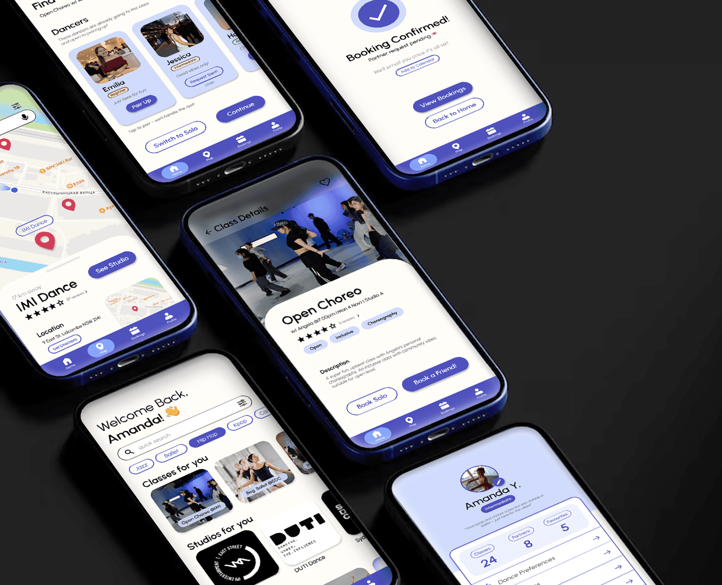
Integrate partner booking directly into the main class booking flow.
This reduced friction while giving users flexibility between solo and social participation.
💭 UX Decisions
Several interaction decisions focused specifically on reducing emotional friction.
Key Design Decisions:
Integrated partner matching into booking flow
Added accessibility and inclusivity tags
Designed clear booking confirmations
Simplified navigation structure
Used familiar card-based layouts for easy scanning
Included flexible solo or partner pathways
The interface intentionally avoided overly competitive fitness aesthetics in favour of a calmer, more welcoming experience.
💭 UI Systems
The visual system was designed to feel:
Friendly
Minimal
Warm
Approachable
Design System Highlights:
Rounded UI components
Soft purple and blue palette
Consistent button states
Spacious layouts and hierarchy
Persistent bottom navigation
Colour-coded tags for accessibility and class levels
Consistency across screens became especially important as the prototype expanded into onboarding, booking, dashboard, and profile flows.
Design Solution


/